blog, Coaching, data, data engineering, data science, portfolio, python

Project:- Who are the Goodest Doggos? Wrangling & Analysing WeRateDogs Tweets to Find the Goodest Floofs

The Project

This project focused on wrangling data from the WeRateDogs Twitter account using Python, documented in a Jupyter Notebook (wrangle_act.ipynb and the subsequent analysis in act_analysis_notebook.ipynb).

This Twitter account rates dogs with humorous commentary. The rating denominator is usually 10, however, the numerators are usually greater than 10. WeRateDogs has over 4 million followers and has received international media coverage. Each day you can see a good doggo, lots of floofers and many pupper images.

WeRateDogs downloaded their Twitter archive and sent it to Udacity via email exclusively for us to use in this project. This archive contains basic tweet data (tweet ID, timestamp, text, etc.) for all 5000+ of their tweets as they stood on August 1, 2017. The data is enhanced by a second dataset with predictions of dog breeds for each of the Tweets. Finally, we used the Twitter API to glean further basic information from the Tweet such as favourites and retweets.

Using this freshly cleaned WeRateDogs Twitter data , interesting and trustworthy analyses and visualizations can be created to communicate back our findings.

The Python Notebooks, and PDF reports written to communicate my project and findings can also be foundĀ here

What Questions Are We Trying To Answer?

  • Q1. What Correlations can we find in the data that make a good doggo?
  • Q2. Which are the more popular; doggos, puppers, fullfers or poppos?
  • Q3. Which are the more popular doggo breeds and why is it Spaniels?

WeRateDogs @dog_rates

WeRateDogs

What Correlations can we find in the data that make a Good Doggo?

First, we wanted to determine if there were any correlations in the data to find any interesting relationships. To do this we performed some correlation analysis and produced visuals to support that. Prior to the analysis, we assumed that Favourite & Retweet would be correlated since these are both ways to show your appreciation for a tweet on Twitter.

The output of our analysis is as follows

This scatter plot matrix shows the relationships between each of the variables. It shows that while there looks to be a strong linear relationship between Favourites and Retweets, there no othe relationships were highlighted.

With that in mind, we wanted to quantify these relationships to solidify our understanding

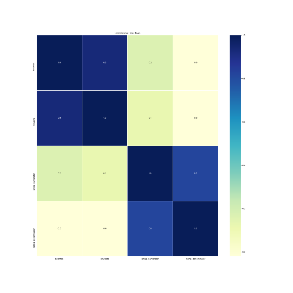
Again, the above heatchart shows our correlation relationships, showing a strong relationship between favourites and retweets with a correlation coeficcient of aprox (r = 0.8)

Let’s narrow in on just that relationship.

With this chart we can see Favourites verses Retweets and it’s strong linearly positive relationship

Observations

  • As we assumed, There is a strong linear relationship between Favourites and Retweets.
  • The regression coefficient for this relationship is (r= 0.797)
  • From the points we plotted, we cannot find any other correlations.
  • In future, we could try and categorize the source and dog_stage to investigate correlations there with popularity of the Tweet.

Which are the more popular; doggos, puppers, fullfers or poppos?

We performed some data wrangling on the tweet_archive dataset to integrate 4 different “Class” of doggos down into one column which would be easier to analyse.

These classes are fun terminologies used by WeRateDogs so it would be really cool to see the popularity of these different types (dog_class = [doggo, pupper, fluffer, puppo])

Can we ascertain which category of dog is more popular?
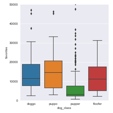
Observations

  • Interesting, as we look at Retweets and Favourites, Puppos are by far the more popular on average containing the higher number of favourites and retweets
  • From the points we plotted, we can see that Puppers have the lower numbers on average, there are a lot of outliers.

Which are the more popular doggo breeds and why is it Spaniels?

Everyone loves doggos, but we all have a different favourite kind. With so many to choose from, which breed really is the goodest doggo and why is it Spaniels?

By integrating the image_prediction data into our dataset, we have three columns denoting the probability chance of the image being of a particular breed. This is some really interesting data to use, lets use it to see if we can determine the popularity of certain breeds of doggos.

Observations

  • We can see the most common types of dog here are Golden Retrievers and Labrator Retrievers, this seems sensible since these dog types are very common. Other dog breeds rounding out the top 5 are Chihuahuas, Pugs and Pembrokes.
  • We could also limit the probability to ensure it meets a minimum probability level
  • Some incorrect values like Seat-Belt, hamster, bath towel still exist in the data which we could clean given more time in future
  • We only used the 1st prediction column, we may have been able to use all 3 to determine the overall probability or popularity of dog breeds
  • There must be some mistake, Spaniels were not even in the top 10!?

Observations and Conclusion

  • During our analysis, we ound that there is a strong linear relationship between the number of Favourites and the number of Retweets of a given Tweet. The regression coefficient for this relationship is (r= 0.797)
  • We did anticipate this relationship already since there is a fair chance that if a user enjoys a twee they have the choice option to Favourite or Retweet it – both are a measure of the users enjoyment of the tweet.
  • We have also found through visualisation and data wrnagling that the pupper is the most popular doggo, with on average, more Retweets and more Favourites per tweet than the other 3 categories Doggo, Fluffer and Puppo.
  • Golden retriever are the goodest doggos, Labrador Retriever, Pembroke, Chihuahua and Pugs complete the top 5 common dog breeds in the data.

The Goodest Doggos

What We Learned

  • How to Programmatically download files using Python <code>requests</code> library
  • How to sign up for and use an API
  • How to use the <code>tweepy</code> library to connect Python to the Twitter API
  • How to handle JSON files in Python
  • How to manually assess and programmatically assess datasets and define Quality and Tidiness Issues
  • How to structure a report to document, define, and test Data Cleansing Steps

References

blog, Coaching, data, data engineering, data science, portfolio, python, Statistics

Project:- Analyse A/B Test Results to Determine the Conversion Rate of a New Web Page

The Project

The project is part of the Udacity Data Analysis Nanodegree. The section of the course is a Project where we perform our own data analysis to determine whether a web-site should change their page design from and old page to a new page, based on the results of an AB test on a subset of users.

The Project aims to bring together several concepts taught to us over the duration of the course, which we can apply to the data set which will allow us to analyse the data and determine probabilities of a user converting or not using various statistical methods based on whether the user used old page or new page

The PDF report written to communicate my project and findings can also be foundĀ here

What We Learned

  • Using proportions to find probability.
  • How to write Hypothesis statements and using these to Test against.
  • Writing out Hypotheses and observation in accurate terminology
  • Using statsmodel to simulate 10000 examples from a sample dataset, and finding differences from the mean
  • Plotting differences from the mean in a plt.Hist Histogram, and adding a representation line for the actual observed difference
  • Using Logistic Regression to determine probabilities for one of two possible outcomes
  • Creating Dummy variables for making categorical variables usable in regression
  • Creating interaction variables to better represent attributes in combination for use in regression
  • Interpreting regression summary() results and accurately concluding and making observations from results

Interesting Snippets

The Code and the Report

References

blog, Coaching, data science, Statistics

A Simple Explanation of Bayes Theorem and Bayesian Inference

While studying through the excellent Udacity Data Analysis Nano Degree , I found myself struggling to answer the Quiz questions on Bayes Theorem. To help myself comprehend it, I did a fair bit of studying other resources too and I came to the conclusion that it might be a. helpful to write an article myself to help reinforce this difficult subject b. but also help others.

In this article I will articulate Bayes Theorem in a simple manner, and guide with some examples.

What Is Bayes Theorem?

Bayesā€™ Theorem is a widely used theory in statistics and probability, making it a very important theory in the field of data science and data analysis. For example, Bayesian inference, a particular approach to statistical inference where we can determine and adjust the probability for a hypothesis as more data or information becomes available.

What Are its Applications?

For example, it can be used to determine the likelihood that a finance transaction is fraud related, or in determining the accuracy of a medical test, or the chances of a particular return on stocks and hundreds of other examples for every industry imaginable from Finance to Sport, Medicine to Engineering, Video Games to Music.

What does it Do?

So as we mentioned – Bayesian inference gives us the probability of an event, given certain evidence or tests.

We must keep a few things in the back of our mind first

  • The test for fraud is separate from the result of it being fraud or not.
  • Tests are not perfect, and so give us false positives (Tell us the transaction is fraud when it isn’t in reality), and false negatives (Where the test misses fraud that does exist.
  • Bayes Theorem turns the results from your tests into the actual probability of the event.
  • We start with a prior probability , combine with our evidence which results in out posterior probability

How Does it Work? An Example

Consider the scenario of tests for cancer as an example.

Where we want to ascertain the probability of a patient having cancer given a particular test result.

  • Chances a patient has this type of cancer are 1% , written as P(C) = 1% – the prior probability
  • Test result is 90% Positive if you have C – written as P(Pos | C) – the sensitivity (we can take 100%-90% = 10% as the remaining Positive percentage where there is no C but the test misdiagnoses it – the false positives
  • Test result is 90% Negative if you do not have C, written as P(Neg | Ā¬C) – the specificity (we can take 100%-90% = 10% as the percentage of negative results but there is C but the test misses it – the false negatives

Lets plot this in a table so it’s a bit more readable.

Cancer – 1%Not Cancer – 99%
Positive Test90%10%
Negative Test10%90%
  • Our Posterior probability is what we’re trying to predict – the chances of Cancer actually being present, given a Positive Test – written as P( C | Pos ) – that is, we take account of the chances of false positives and false negatives
  • Posterior P( C | Pos ) = P ( Pos | C) x P( C ) = .9 x .001 = 0.009
  • While P( Ā¬C | Pos) = P ( Pos | Ā¬C) x P(Ā¬C) = .1 x .99 = 0.099

Lets plot this in our table.

Cancer – 1%Not Cancer – 99%
Positive TestTrue Pos
90% * 1% = 0.009
False Pos
10% * 99% = 0.099
Negative TestFalse Neg
10% * 1% = 0.001
True Neg
90% * 99% = 0.891

But of course that’s not the complete story – We need to account for the number of ways it could happen given all possible outcomes

The chance of getting a real, positive result is .009. The chance of getting any type of positive result is the chance of a true positive plus the chance of a false positive (0.009 + 0.099 = 0.108).

So, our actual posterior probability of cancer given a positive test is .009/.108 = 0.0883, or about 8.3%.

In Bayes Theorem terms, this is written as follows, where c is the chance a patent has cancer, and x is the positive result

  • P(c|x) = Chance of having cancer (c) given a positive test (x). This is what we want to know: How likely is it to have cancer with a positive result? In our case it was 8.3%.
  • P(x|c) = Chance of a positive test (x) given that you had cancer (c). This is the chance of a true positive, 90% in our case.
  • P(c) = Chance of having cancer (1%).
  • P(Ā¬ c) = Chance of not having cancer (99%).
  • P(x|Ā¬ c) = Chance of a positive test (x) given that you didnā€™t have cancer (Ā¬ c). This is a false positive, 9.9% in our case.

Resources

blog, Coaching, data, data engineering, data science, portfolio, python, Statistics

Project:- Data Analysis of Movie Releases, in Python

The Project

The project is part of the Udacity Data Analysis Nanodegree. The section of the course is a Project where we perform our own analysis on a data-set of our choosing from a prescribed list. I chose Movie Releases, a processed version of this dataset on Kaggle :  https://www.kaggle.com/tmdb/tmdb-movie-metadata/data

The Project aims to bring together several concepts taught to us over the duration of the course, which we can apply to the data set which will allow us to analyse several attributes and answer several questions that we ask of the data ourselves.

I downloaded the data from the above link. I then imported the data into Python so we could use a Jupyter Notebook to create the required report, which allows us to document and code in the same document, great for presenting back findings and visualisations from the data.

I structured the project similarly to the CRISP-DM method – that is I i. Stated the objectives, ii. Decided what questions to ask of the data, iii. Carried out tasks to understand the data, iv. Performed Data Wrangling and Exploratory Data Analysis and then drew conclusions and answered the questions posed.

The PDF report written to communicate my project and findings can also be found here

What We Learned

  • Using Hist and plot() to build Histograms visualisations
  • Using plotting.scatter_matrix and plot() to build scatter plot visualisations
  • Changing the figsize of a chart to a more readable format, and adding a ‘;’ to the end of the line to remove unwanted tex
  • Renaming data frame Columns in Pandas
  • Using GroupBy and Query in Pandas to aggregate and group selections of data
  • Creating Line charts, Bar charts, Heatmaps in matplotlib and utilising Seaborn to add better visuals and formatting like adding appropriate labels, titles , colour
  • Using lambda functions to wrangle data formats
  • Structuring a report in a way that is readable and informative, taking the reader through conclusions drawn

Interesting Snippets

Average budget verses Average Revenue of Genres
Average RoI (Revenue by Budget)
Two dimensional analysis of Genres over Time, judging the average Budget, Revenue and Ratings
Top 10 Directors by their Total Revenue

The Code and the Report

  • GitHub repository for the data, SQL, PDF report and Jupyter Notebook
  • the PDF report can also be found here

References

blog, Coaching, data, data engineering, data science, portfolio, python, Statistics

Project:- Data Analysis of Wine Quality, in Python

The Project

The project is part of the Udacity Data Analysis Nanodegree. The section of the course is a Case Study on wine quality, using the UCI Wine Quality Data Set:Ā https://archive.ics.uci.edu/ml/datasets/Wine+Quality

The Case Study introduces us to several new concepts which we can apply to the data set which will allow us to analyse several attributes and ascertain what qualities of wine correspond to highly rated wines.

I downloaded the data from the above link. I then imported the data into Python so we could use a Jupyter Notebook to create the required report, which allows us to document and code in the same document, great for presenting back findings and visualisations from the data.

I structured the project similarly to the CRISP-DM method – that is I i. Stated the objectives, ii. Decided what questions to ask of the data, iii. Carried out tasks to understand the data, iv. Performed Data Wrangling and Exploratory Data Analysis and then drew conclusions and answered the questions posed.

The PDF report written to communicate my project and findings can also be foundĀ here

What We Learned

  • Using Hist and plot() to build Histograms visualisations
  • Using plotting.scatter_matrix and plot() to build scatter plot visualisations
  • Changing the figsize of a chart to a more readable format, and adding a ‘;’ to the end of the line to remove unwanted text
  • Appending data frames together in Pandas
  • Renaming data frame Columns in Pandas
  • Using GroupBy and Query in Pandas to aggregate and group selections of data
  • Creating Bar charts in matplotlib and using Seaborn to add better formating
  • Adding appropriate labels, titles , colour
  • Engineering proportionality in the data that allows data sets be compared more easily

The Code and the Report

  • GitHub repository for the data, SQL, PDF report and Jupyter Notebook
  • the PDF report can also be found here

References


blog, data, data science, python, Statistics

Project:- Data Analysis of Global Weather Trends Compared to Edinburgh, in Python

The Project

The project is part of the Udacity Data Analysis Nanodegree. The project requires the student to extract Global average temperature data and the average temperature of a local city. In this case I chose Edinburgh. We then need to discuss what questions we want to ask of the data, analyse the data, visualise the data and draw our conclusions.

I extracted the data from the Udacity virtual environment using SQL. I then imported the data into Python so we could use a Jupyter Notebook to create the required report, which allows us to document and code in the same document, great for presenting back findings and visualisations from the data.

I approached the project by first deciding what questions to ask of the data. I then imported the data to Python using Pandas and carried out some rudimentary exploration of the data to understand its layout, structure, number of records and so on . To prepare the data for visualisation, I then applied the rolling() function to the data to smooth out some of the jagged changes in the data

With the data now using a rolling window, I then visualised the data in both a Line chart and a Box Plot for the Global data and Local data so that we can compare, ascertain trends and answer the questions posed.

Finally, I drew conclusions and answered our questions we posed at the start.

The PDF report written to communicate my project and findings can also be foundĀ here

What We Learned

  • How to approach an analysis project, posing questions and drawing conclusions
  • Manipulating data in Python
  • Creating a rolling average in Python using the rolling() function
  • Utilising Matplotlib to visualise data in Line charts and Box plots, complete with customised colour, axis, labels and title

The Code and the Report

  • GitHub repository for the data, SQL, PDF report and Jupyter Notebook
  • the PDF report can also be found here

References

blog, Coaching, data, data engineering, data science

Part 1 – Why The Time is Right to Grow Your Skills in Data

Data is the New Frontier

The demand for strong data skills is sky rocketing. With the rapid growth in Big Data, tools and technologies maturing and cloud computing coming to fruition, we’re amidst what some are calling the fourth industrial revolution and the Information Age.

Every major organisation is making use of their data and analytics to new opportunities and cost savings. If they are not, expect them to be left behind. As things stand, 77% of top organisations consider data analytics a critical component of business performance. 


Why You Should Learn and Grow Data Skills

Globally, companies are clamouring for those with strong capabilities in capitalising on data. With that, your data skills can bring you increased job prospects and pay, while also bringing you huge influence, policies and decision making potential in the workplace. 


CIOs globally ranked analytics and business intelligence as the most critical technology to achieve the organizationā€™s business goals. Naturally, data and analytics skills are the No. 1 sought-after talent

SARAH HIPPOLD, Gartner ARticle
August 17, 2018

Well I’m not driven by money, and I’m certainly not driven to be the centre of attention! So why do I spend time learning? 

  • The Data Landscape is changing. Oracle and SQL experience got me into the industry. Today, while Oracle is still a giant, you could argue that they’re behind Big Data technologically speaking. Data is the new business language. What’s more, as we are in the ascent of the data industry, software engineering, artificial intelligence and automation all combining, todays skills requirements are changing rapidly. 
    The industry is moving and changing at rapid pace – To learn is to stay relevant 
  • It’s really satisfying growing your skills, not only that but then getting to use them! If you are in the Data industry, this is the perfect change to learn Big Data, Analytics, Visualisation- You can learn and apply those skills almost instantly as companies are crying out for these skills.
  • Dictate a career for the next decade – Big Data Engineer, Data Analyst, Machine Learning Developer, Data Scientist, Data Architect, DevOps Scrum Master – There is a genuine industry here that is growing. Roles are diverging into distinct skill sets – you can choose what interests you most and have a successful career. What’s more, data is not tied to any business industry – the skills used in Finance or Banking can be transferred to Video Gaming, Movie Streaming, Logistics, E-Commerce – where ever your interests lie!

Part 2 to come – How to Grow your Data Skills


Resources

blog, Coaching, data, data science, Project Management, python, stakeholder management

Applying CRISP-DM to Data Science and a Re-Usable Template in Jupyter

What is CRISP-DM?

CRISP-DM is a process methodology that provides a certain amount of structure for data-mining and analysis projects. It stands for cross-industry process for data mining. According to polls popular DataĀ  Science website KD Nuggets, it is the most widely used process for data-mining.


The process revolves are six major steps:

1.Ā Ā Ā Ā Ā Ā Ā Business Understanding

Start by focusing on understanding the objectives and requirements from a business perspective, and then using this knowledge to define the data problem andĀ  project plan.

2.Ā Ā Ā Ā Ā Ā Ā Data Understanding

As with every data project, there is an initial hurdle to collect data and to familiarise yourselfĀ with it, identify data quality issues, discover initial insights, or to detect interesting nuggets of information that might for a hypothesis for analysis.

3.Ā Ā Ā Ā Ā Ā Ā Data Preparation

The nitty-gritty dirty work of preparing the data by cleaning it, merging, moulding it etc to form a final dataset that can be used in modeling.

4.Ā Ā Ā Ā Ā Ā Ā Modeling

At this point we decide which model techniques to actually use and build them

5.Ā Ā Ā Ā Ā Ā Ā Evaluation

Once we appear to have good enough quality model results, these need to be tested to ensure they test well against unseen data and that all key business issues have been answered.

6.Ā Ā Ā Ā Ā Ā Ā Deployment

At this stage we are ready to deploy our code representation of the model into an production environment and solve our original business problem.

Why Use It ?

Puts the Business Problem First

One of the greatest advantages is that it puts business understanding at the centre of the project. This means we are concentrating on solving the business’s needs first and foremost and trying to deliver value to our stakeholders.

Commonality of Structured Solutions

As a manager of Data Scientists and Analysts it also ensures that we stick to a common methodology to maintain optimal results that the team can follow, ensuring we have a followed best practice or tackled common issues.

Flexible

It’s also not a rigid structure – It’s malleable and steps are repeatable, and often you will naturally go back through the steps to optimise your final data set for modeling.

It does not necessarily need to be mining or model related. Since so many of the business problems today require extensive data analysis and preperation, the methodology can flex to suit other categories of solutions like recommender systems, Sentiment analysis, NLP amongst other

A Template in Jupyter

Since we have a structure process to follow, it is likely we have re-usable steps and components. Ideal for re-usable code. What’s more, a Jupyter notebook can contain the documentation necessary for our business understanding and description of each step in the process.

To that end, I have a re-usable notebook on my DataSci_Resources GitHub Repository hereĀ 

Resources

blog, Coaching, data science, Project Management, Statistics

Using the Pareto Principle to Drive Value in Project Management

What is the Pareto Principle

The Pareto Principle (also commonly known as the 80/20 principle), is an observation which states that 80 percent of outputs come from 20 percent of the inputs. It was first observed by the Italian economist Vilfredo Pareto, who observed that 80% of Italy’s wealth, came from 20% of its population. He found that this principle held roughly true in other countries and situations as well.

The Pareto Principle is a neat guide of describing distributions in real-life scenarios that holds true in a vast array of situations. That is, that each input in a scenario, is unequally distributed to the outputs of that situation.

For example;

  • A common adage on Computer Science is that 20% of features contribute 80% of usage
  • MicrosoftĀ also noted that 20% of bugs contribute 80% of crashes. While also finding that 20% of effort contributed 80% of features
  • 20% of customers contribute to 80% of income
  • 20% of workers contribute 80% of the work

It’s notĀ simply a case of investing the same amount of input and getting an equal value out.

pareto principle graph

(Better Explained)

Why Use the Pareto Principle

I want to propose how valuable this observation is in project management and to consider using this to gain massive return on investment by adhering to it as a principle, beyond understanding the underlying statistic, whether in your own life or in your work.

If we accept that 20% of the effort produces 80% of the results in a project or product; it conversely holds true that 80% of the effort produces only 20% of the results. In investment terms, that is a massive investment of a resource for an increasingly diminishing return on investment (law of diminishing returns) – you wouldn’t want your investment banker running those odds, so why adhere to it in life or in project management?

Instead of investing so much more in terms of effort and resource to ‘complete’ a project or product, we could focus primarily on the efforts that produce the majority of the results and forget the rest, or at least use this to make an informed decision to prioritiseĀ  investments on other projects before coming back to ‘complete’ the project.

Considering this, with the 80% of resources saved, we can invest in further projects and products and get 80% return on each of them – huge returns for the same inputs!

1_0NSXtsSkOEEjpIQE5XZ9Rw

Conclusion

As project managers, it’s our responsibility toĀ find the most efficient way to get projects completed. There is a set of tasks that generate a disproportionate amount of work.

With this in mind, I want you to consciously make a decision on how we allocate resource, and not keep aiming for the perfect final product. You may very well want the perfect product, but the key is that we have a choice.

For Example;

  • Create 5 wire-frame prototypes instead of 1 detail one
  • Build 5 features with 80% of the functionality rather than 1 perfect one
  • Find a solution to 5 bug that solves the issue for 80% of users rather than 1 that resolves it for everyone

That said, if we still need the final product 100% completed, it is about making an informed decision now that will optimise our investments – focus on the 20%’ers first that produce the best bang for our buck, re-prioritising as we see fit, before returning to attain 100%.

ā€œThe difference between successful people and very successful people is that very successful people say ā€œnoā€ to almost everything.ā€

ā€” WarrenĀ Buffett


References

blog

Reading List:- 2018

In 2018, IĀ changed my view on New Yearā€™s resolutions. I wanted fewer aspirations that were bolted onto my life and rather fundamentally switched to a mind-set of how to become the person I wanted to be. I believe strongly in growth and self improvement, but reading is one thing I have always dithered on. However, as I’ve gotten older I’ve come to really appreciate both the benefit mentally but more importantly the sheer joy of a fantastic read.

So to become a more well-rounded individual I wanted to read more. How do I track that? Stats of course! I figured 12 would be a nice round number. One per month – how hard can that be?

Of course, if you have any suggestions, please let me know!

  1. Foundation by Isaac Asimov
  2. Hitch-hikers Guide to the Galaxy by Douglas Adams
  3. Man in the High Castle by Philip K. Dick
  4. Ā Beren & Luthen by J.R.R. Tolkien
  5. How to Make Friends and Influence People by Dale Carnegie
  6. Confident Data Science Skills by Kirill Eremenko
  7. Data Science for Business byĀ Foster Provost and Tom Fawcett
  8. The Subtle Art of not Giving a F*ck by Mark Manson
  9. Storytelling with Data – Cole Nussbaumer Knaflic
  10. Modern Romance by Aziz Ansari
  11. Ā Think Stats: Exploratory Data Analysis by Allen B. Downey (in Progress)
  12. Ā Fantastic Night & Other Stories by Stefan ZweigĀ (in Progress)

On my “To Do” List are:

01 – Catcher in the Rye by J.D. Salinger

02 – The Spy Who Came in From the Cold – John le Carre

03 – Hands-On Machine Learning with Scikit-Learn & TensorFlow by Aurelien Geron

04 – Red Rising by Pierce Brown